Identity and Brand Guidelines
QMENTA
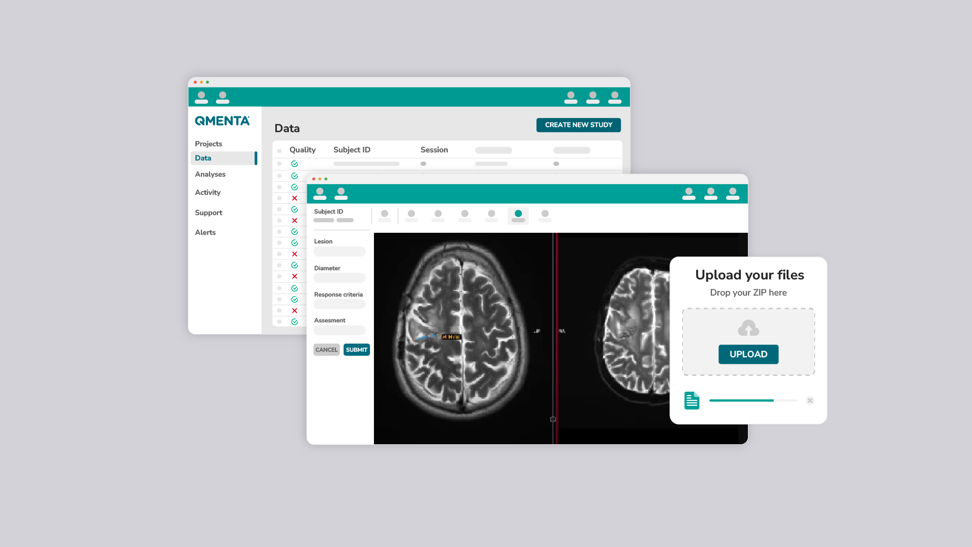
QMENTA is a medical imaging software providing an integrated solution for clinical trials and medical professionals to seamlessly perform tasks in the cloud, eliminating physical limitations.
The brand required a versatile identity applicable to both digital SaaS products and physical materials for conferences.
Beyond its integration capabilities, QMENTA accelerates medical processes from years to weeks, introducing innovation and technology to the medical field. These aspects are core elements of our brand communication.
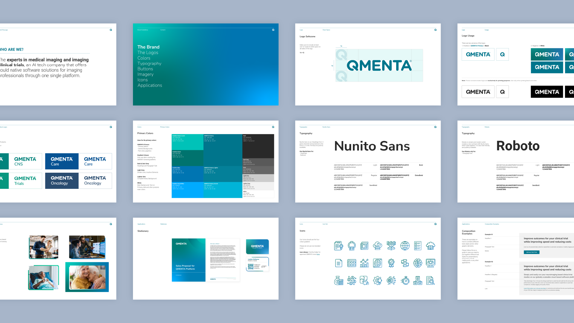
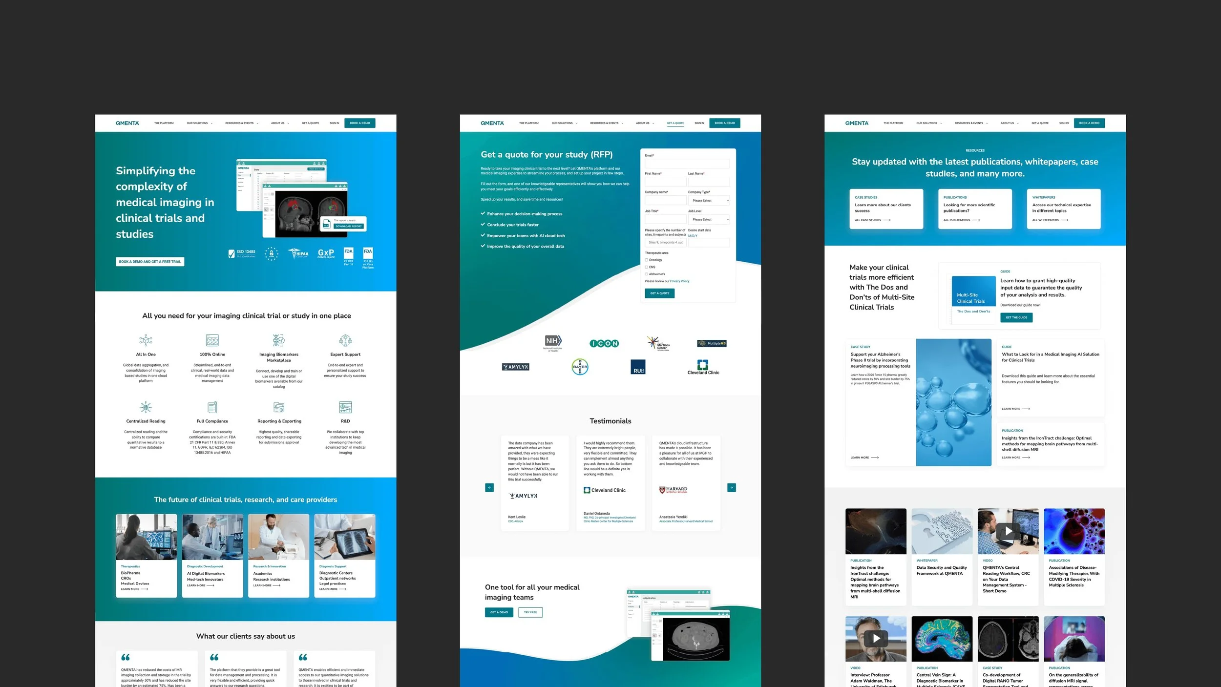
The creation of the new QMENTA brand, featuring new color palettes, typography, iconography, imagery, layout, and framing, enhances its look and feel. This transformation creates a strong and memorable brand identity.
The implementation of new design guidelines ensures a cohesive and intuitive identity in QMENTA's internal and external communications. The visually consistent approach across different touchpoints reinforces brand recognition, making QMENTA easily recognizable to our target audience.
Brand
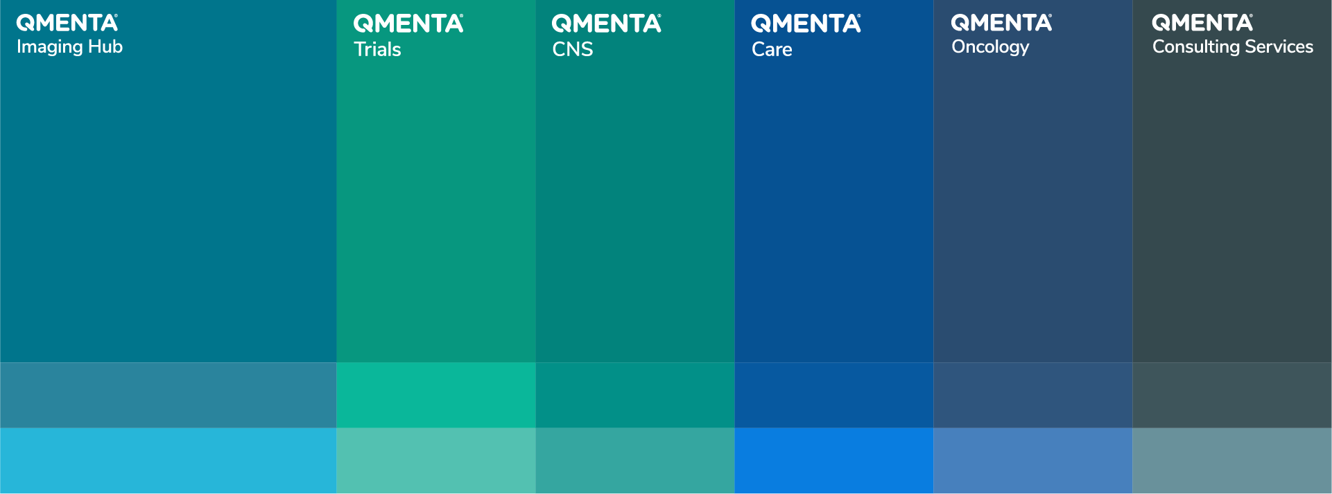
Brand Colors
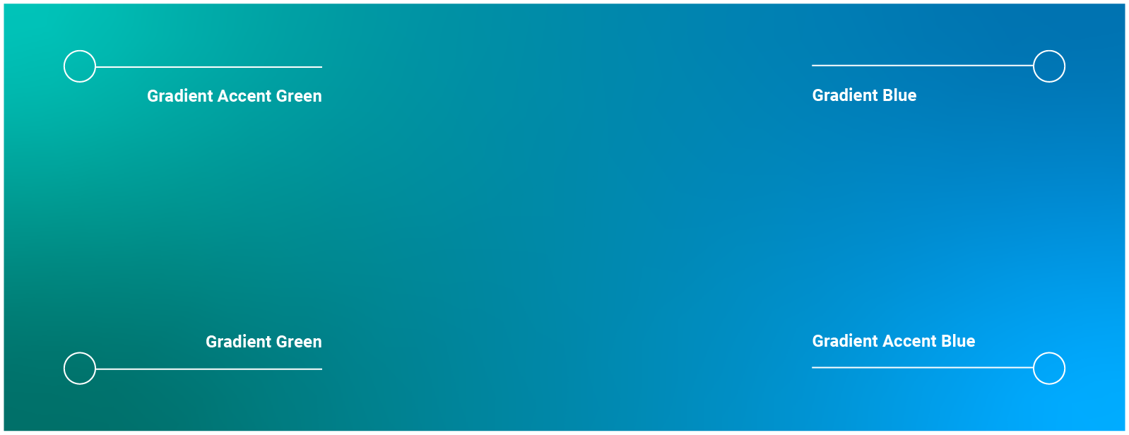
Brand Gradient
Typography
Imagery and frames
Icons
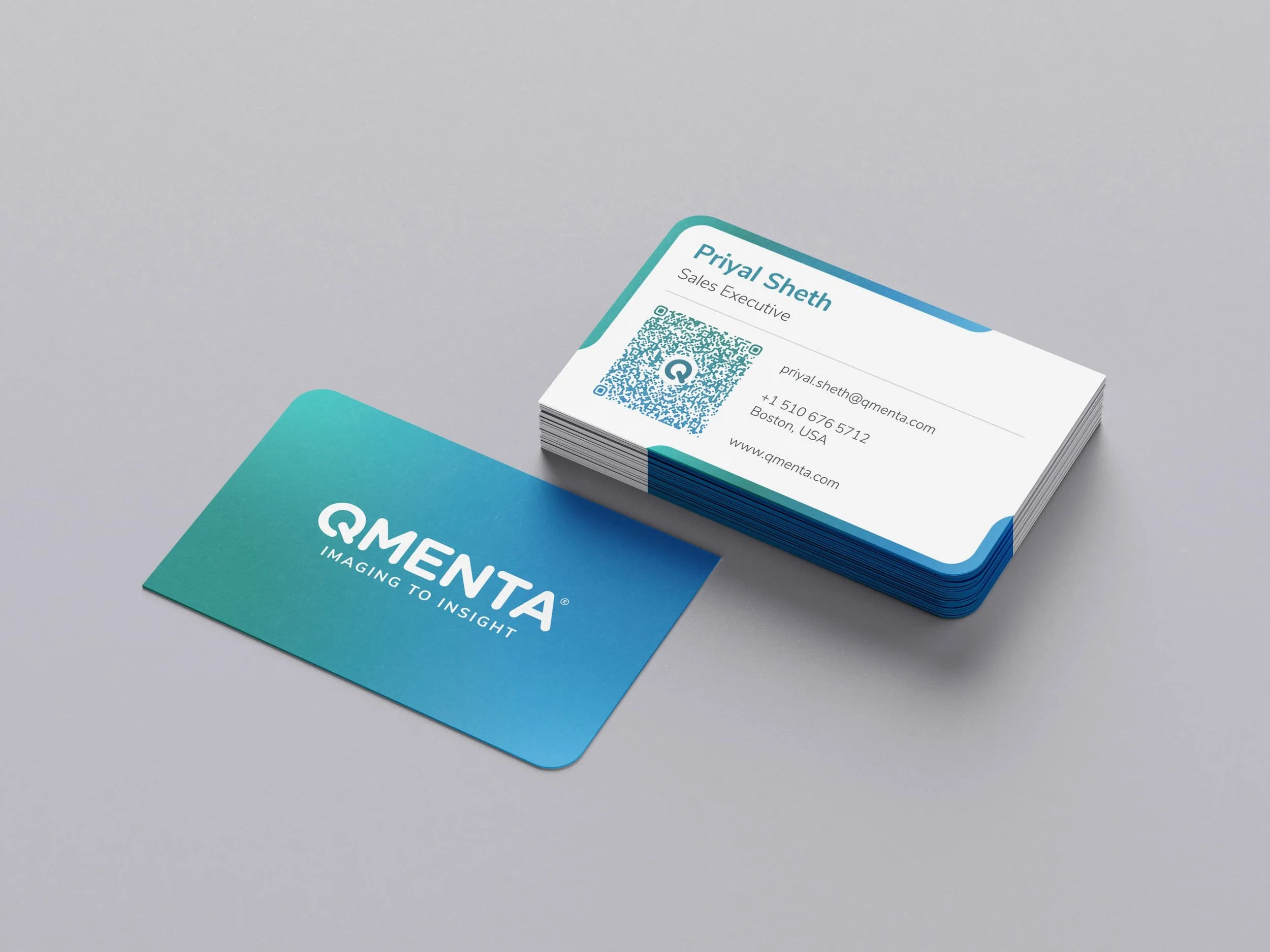
Applications

