Brand Designer
I design brands
that look premium and feel friendly.
Software
Selected Work
Kolonna


Patterns & Icons
Social Media
What I did
Kolonna’s logo stayed, so I added a Day Spa lockup and a short version and built the new look around it. The graphics use columns and arches from classical Greek architecture (“Kolonna” means “column” in Latvian). The palette is white and beige with blue accents, meant to feel premium and open to everyone. I also made icons, patterns and social templates.
My part
Freelance, three months, with one other team member. They set the concept and the base colors. I turned them into a working system.
What changed
The logo is on the windows of Kolonna’s spas and salons. Its social media runs on my fonts and the new style.
QMENTA




Design System
What I did
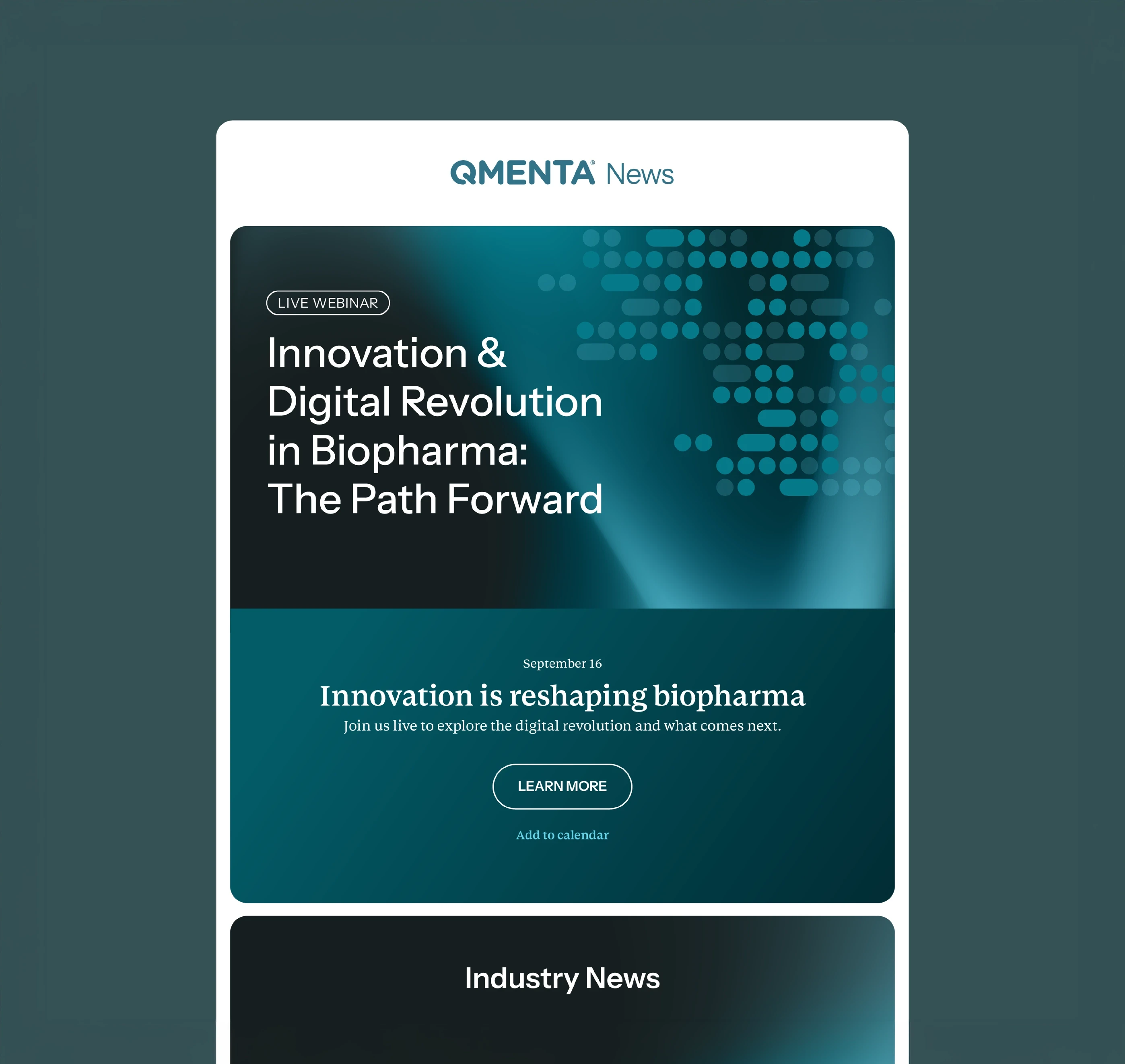
I refreshed the brand twice: a deeper palette, two web fonts shared with the product, and guidelines. Most competitors looked alike, so I researched them and defined a bolder third direction from the teal and the Q from the logo.
My part
In-house for four years, and the only designer for most of it. Marketing owned the message. I owned the visual side, the product design and its design system.
What changed
Both refreshes went live. Sales used my templates, and at events people said “you’re the brand with the nice visuals.” Clients saw my product designs in demos. The third direction didn’t ship, because I left while it was underway.
“Mariana has an eye, understanding, and motivation to apply digital and visual solutions for a variety of problems.”
Salvis Āre
UX Design Lead, QMENTA
Laberinto


Illustration
What I did
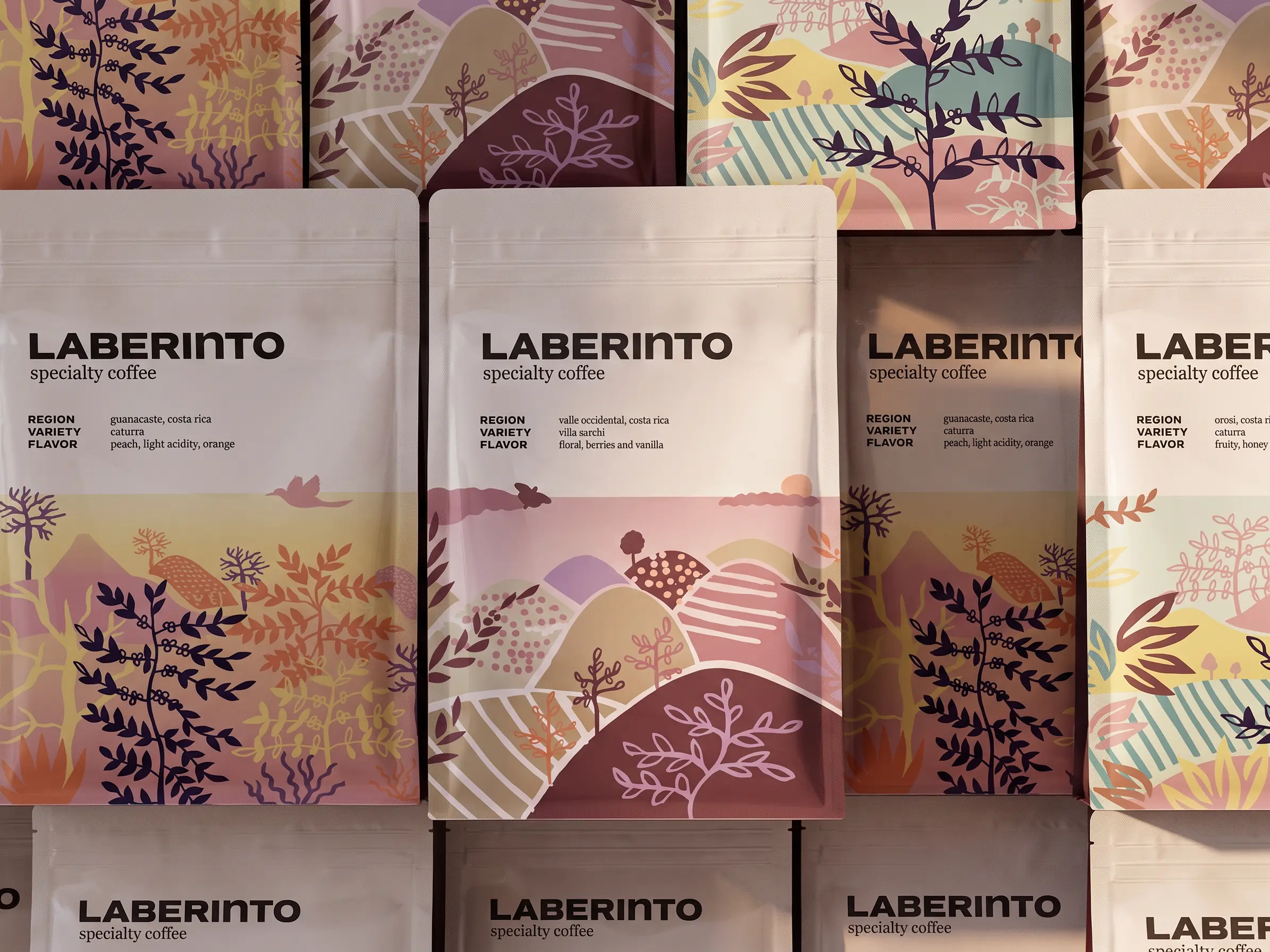
Most Costa Rican coffee brands looked outdated to me, so I designed one for international tourists. It has five regions, each with its own palette and composition, held together by the same elements and illustration style. It runs across bags, a menu, cups and merchandise.
My part
All of it: concept, illustration and identity. It’s my 2019 master’s thesis. I refreshed the logo and font, and remade the mockups, for this portfolio.
Maricoco


Brand Identity
Art Direction
What I did
I built the brand for my own illustration business, which I started in 2015. The name comes from my full name. The logo has bold letters I drew by hand, and they stand out against the finer line work in the illustrations. Every collection gets its own palette but keeps the same illustration style, so new collections still look like Maricoco. I used it on notebooks, scarves, textiles and the packaging for them.
My part
All of it: the identity, the illustrations, the packaging, production and sales. It’s quieter now. I refreshed the logo for this portfolio.